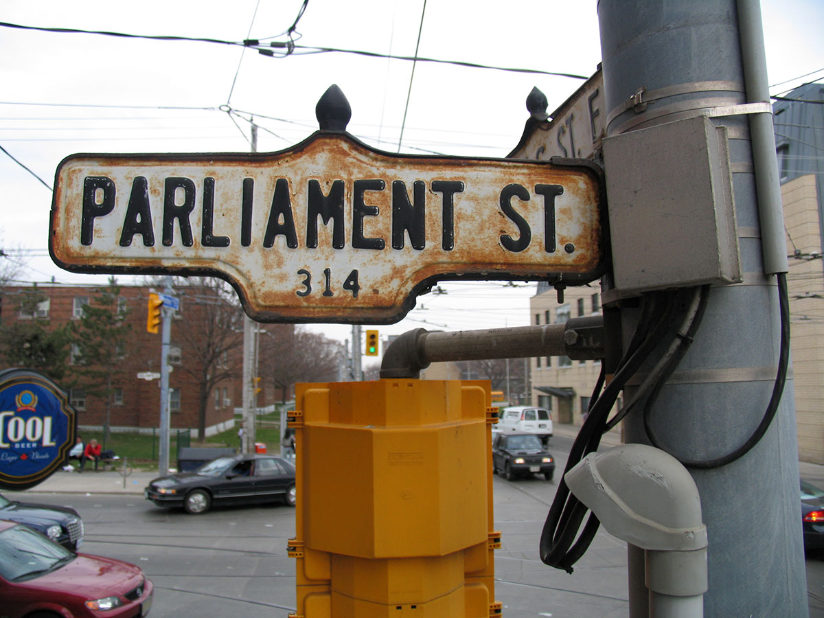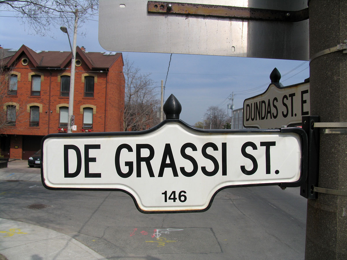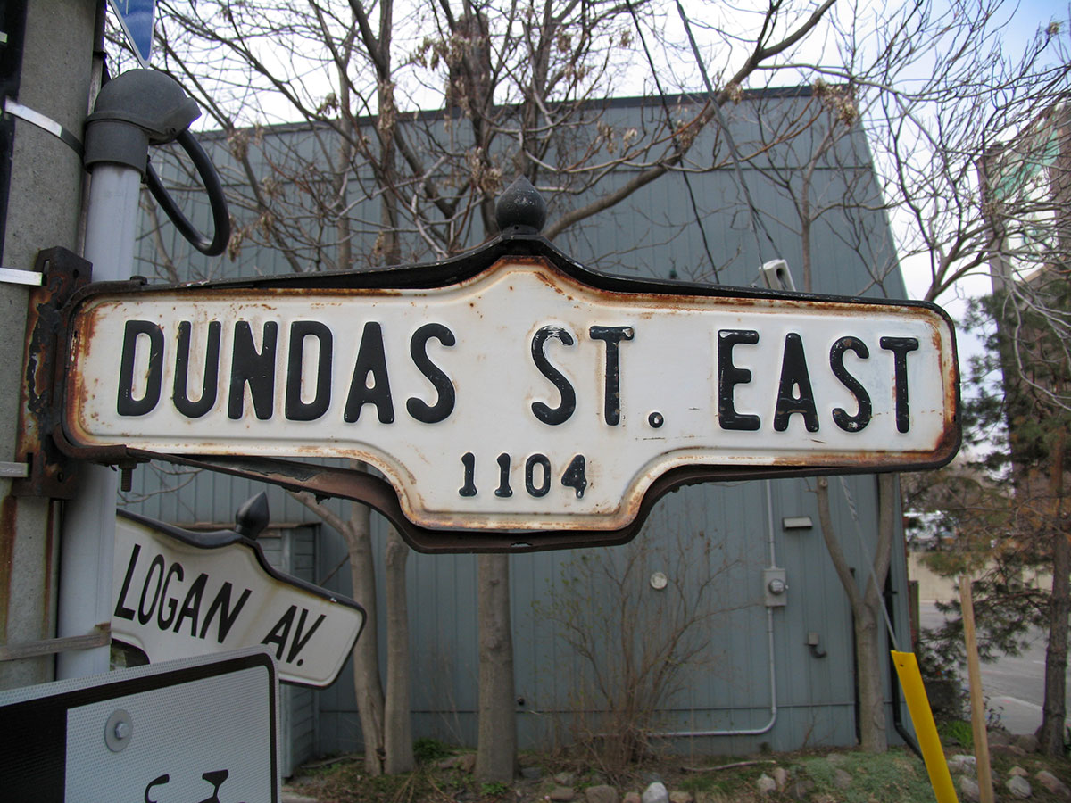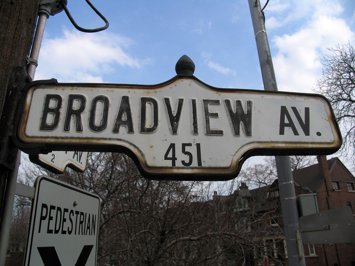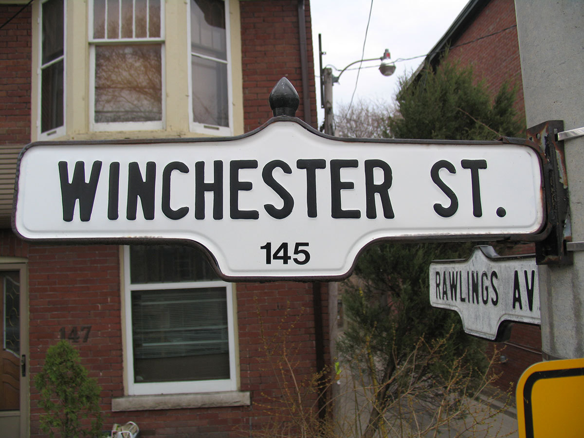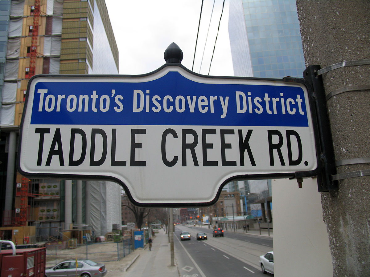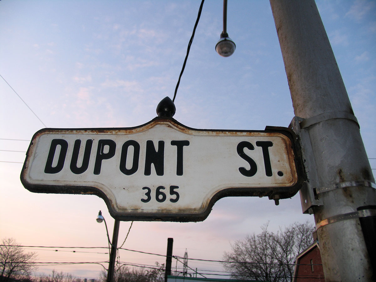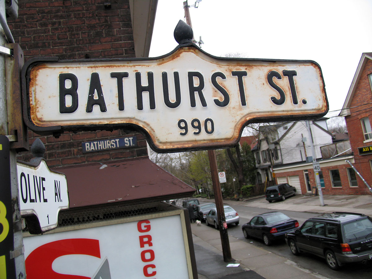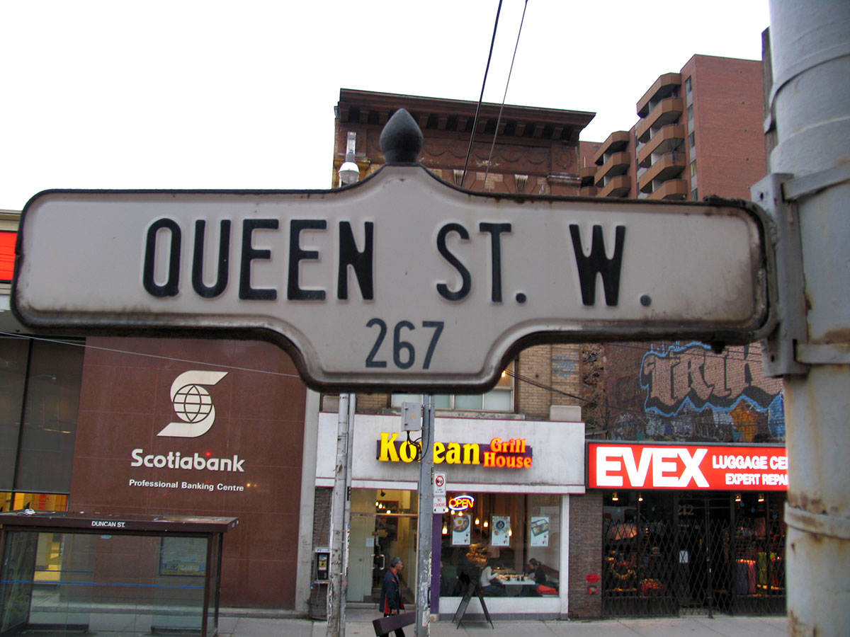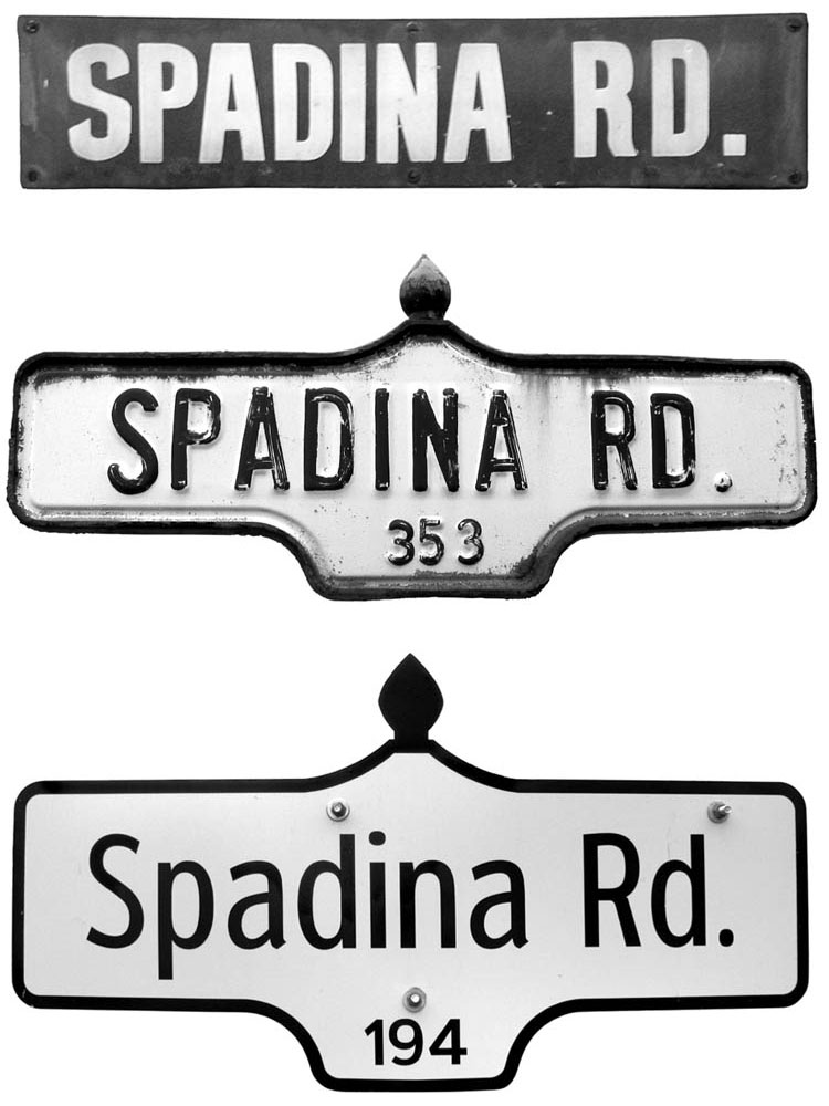
Chalk up another victory for cars over people. The legacy? New and “improved” street signs dotting Toronto’s roadways. Unlike the large street markers that began hanging over the city’s major intersections in 1999 and could, theoretically, be removed with no harm done, these new signs signal a more permanent change to Toronto’s urban landscape. The city says the new design (twenty-five per cent larger than that of its predecessor) is a response to the increasing number of complaints from baby boomers unable to find their turn while driving—no doubt a result of sitting too high up and driving too fast in their S.U.V.s as much as of the aging process.
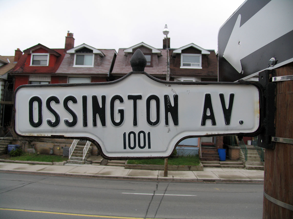
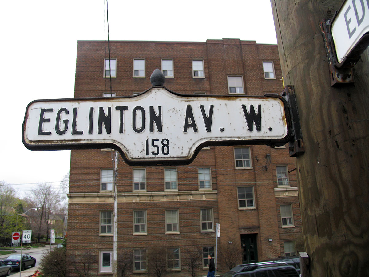
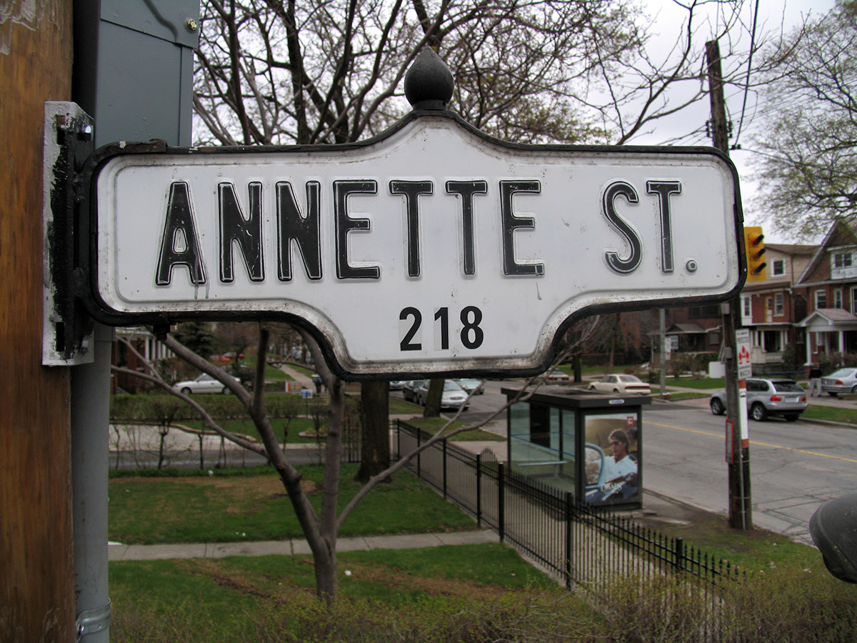
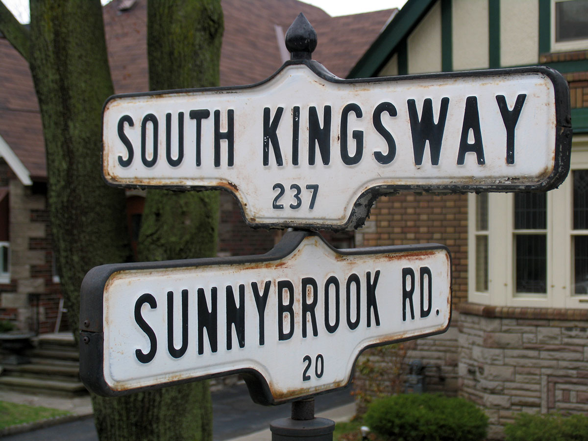
Toronto’s new signs are also a victory for the bottom line. What cost six dollars and ninety-five cents per unit in 1947, the year the former street sign design was adopted, has since risen to nearly one hundred and fifty dollars. As a result, the city has found ways to manufacture its street signs—a two-part sign held together with a metal casing, featuring embossed, upper-case sans-serif lettering and crowned by a black knob, or “acorn”—more and more cheaply over the years, most notably by replacing the embossed letters with stick-on ones. The new signs—two one-sided metal panels bolted together and, thus, not requiring a metal frame—cost almost half the price.
While previous cost-cutting measures managed to retain a look and feel nearly identical to the 1947 originals, the replacement signs feature a new typeface (the cheekily named Clearview), not to mention a number of exposed bolts. Most noticeably, the lack of a metal casing means the loss of the acorn, replaced by a two-dimensional representation. The end result rings of fake authenticity, a cartoon reflection of what came before.
Sadly, these new signs have been met by positive reviews or, more commonly, indifference. And while a number of pre-1947 white-on-blue street signs remain safely bolted to the sides of buildings across the city, it seems unlikely any 1947-style signs will remain in a few years’ time. Seconds may be saved from an across-town road trip, but pity the poor pedestrian, whose walk to work has become a lot less stylish.