How do you illustrate a literary magazine?
It’s a curious question, and back in 1991, I faced it while serving as the editor of Acta Victoriana, the student literary journal of Victoria University, at the University of Toronto. Like the many editors before me, I gathered together a stack of what I hoped was impressive student writing, had it typeset and proofread, and then wondered, “What the heck should I put on the cover? ”
The cover of a literary journal is a strange and awkward affair. The contents of each issue are often a bazaar of frankly uneven goods, so there’s no single image that could possibly encapsulate them all. Instead, campus lit-mag editors usually strain to produce a cover that will capture, in some vague sense, the visual Zeitgeist of the age: trends in graphic design and art, interesting things they’ve seen in other magazines and journals, all munged up with an inchoate sense of what looks “collegiate.” It’s sort of like Mad Men, except with absolutely no idea what you’re doing; and because editors change every year, there’s certainly no continuity.
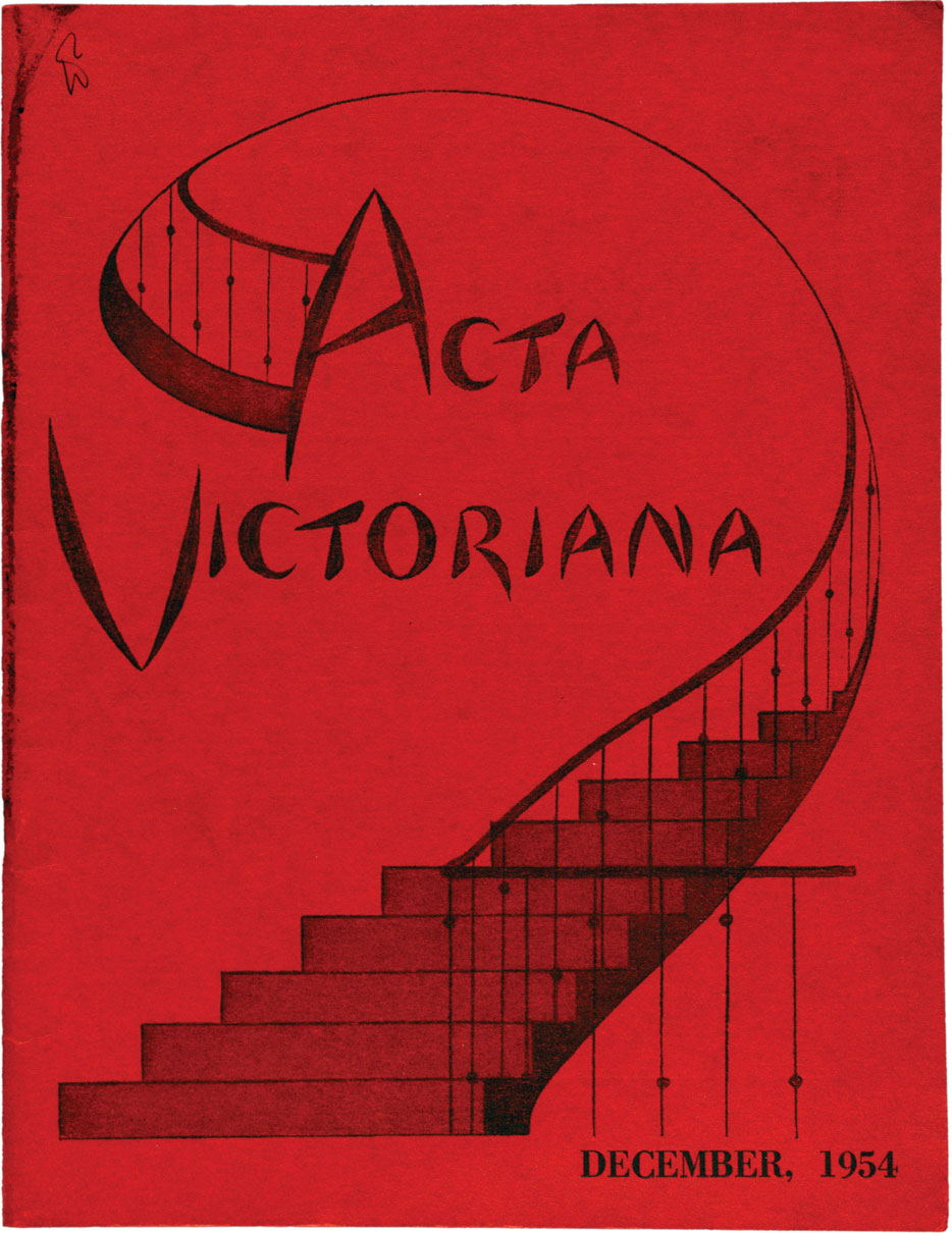
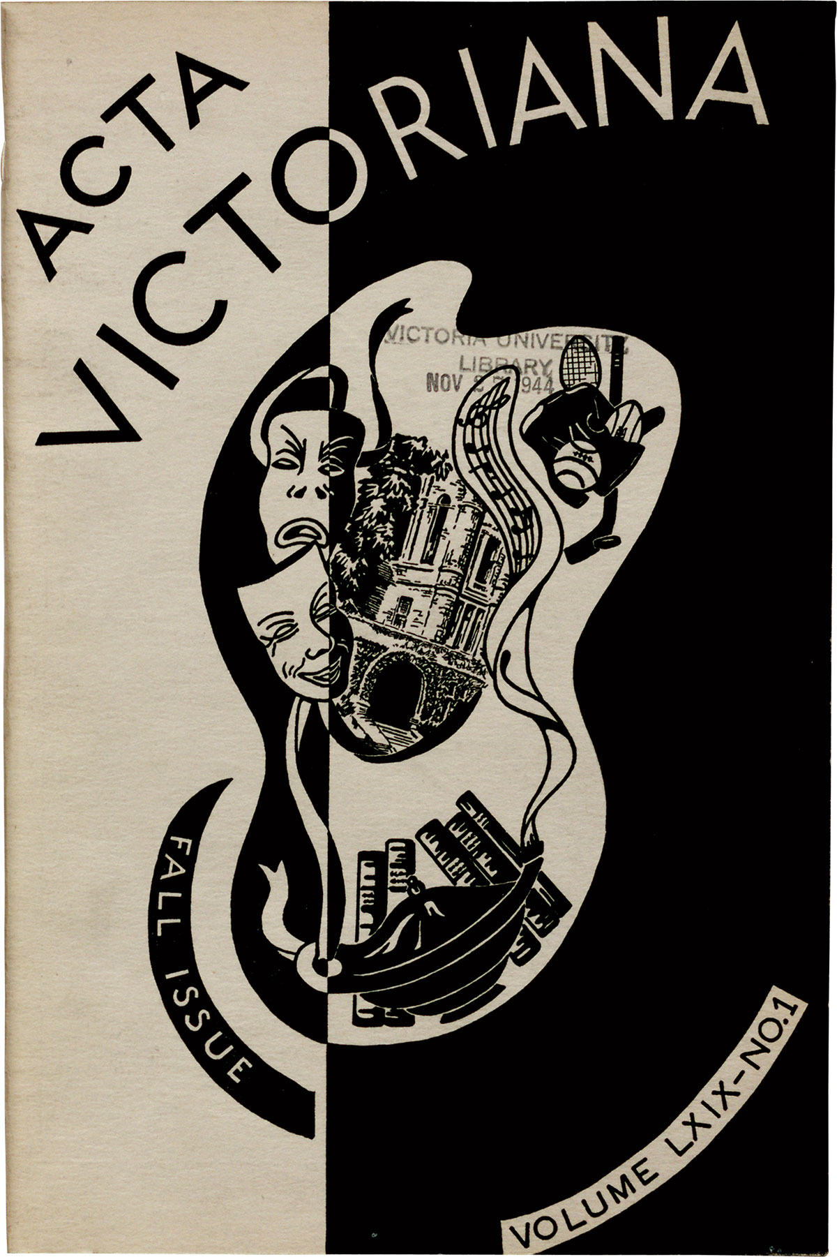
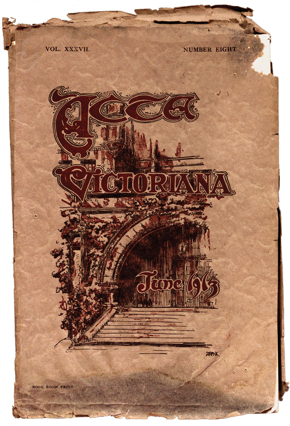
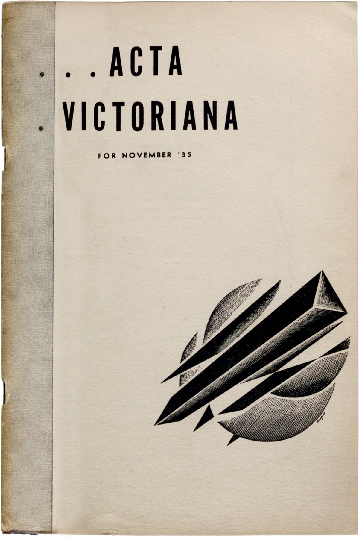
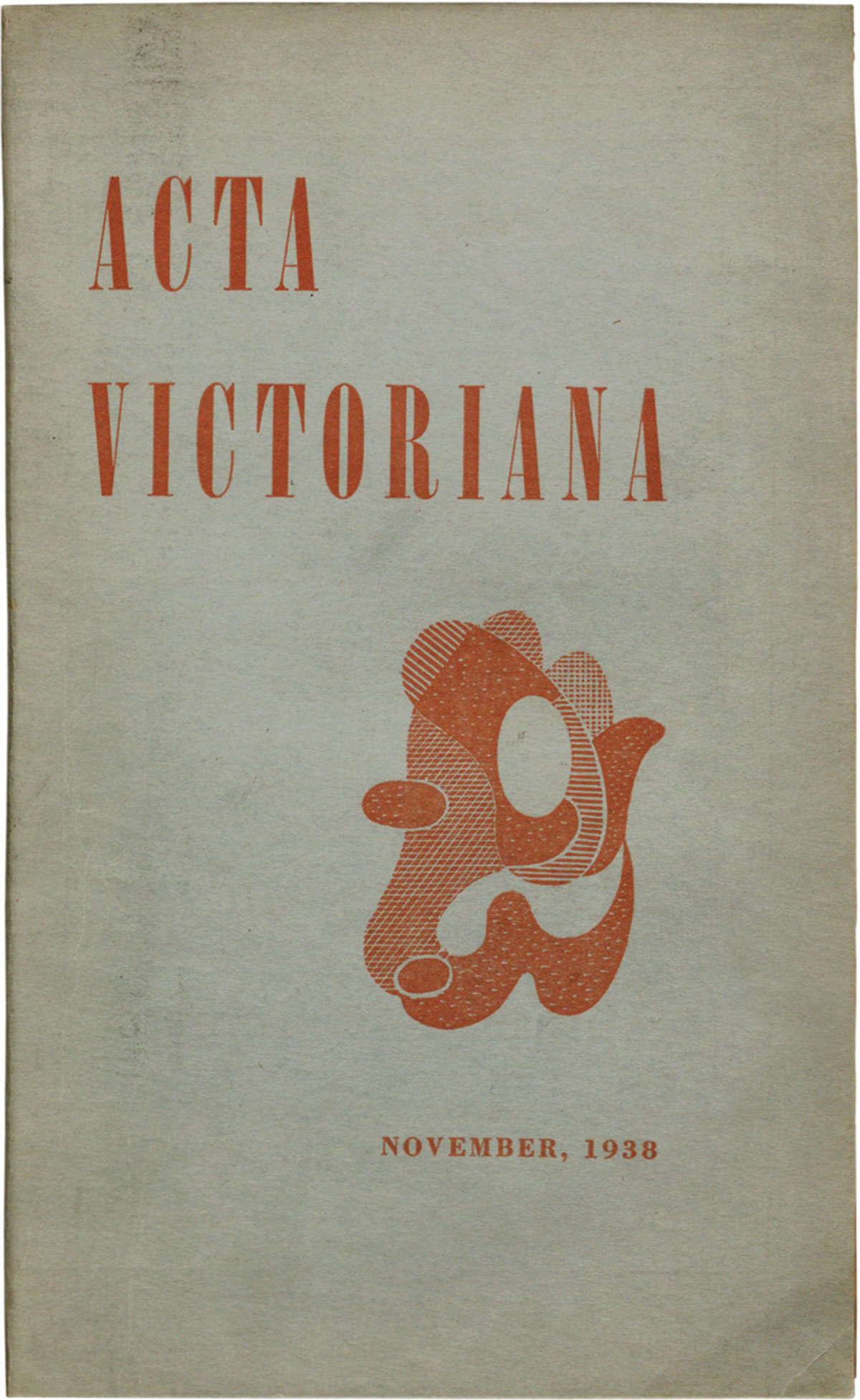
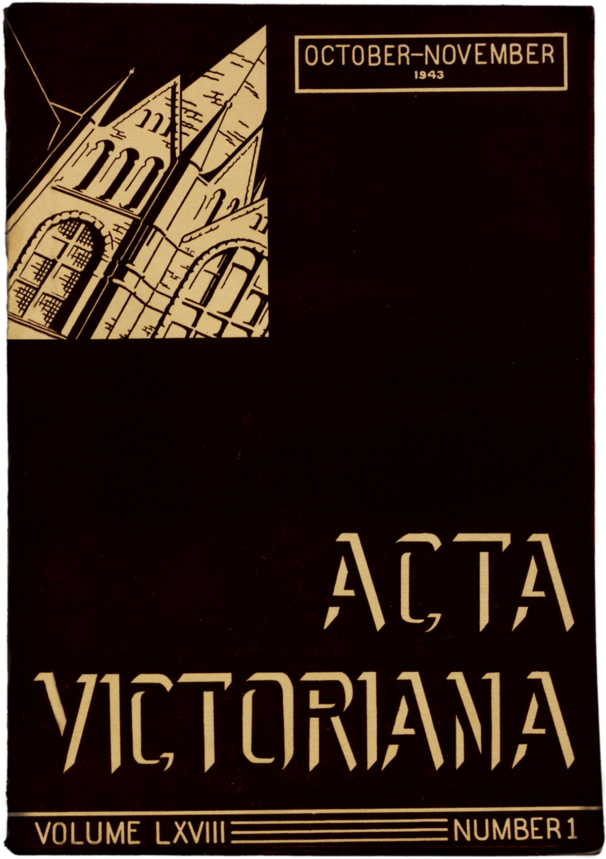
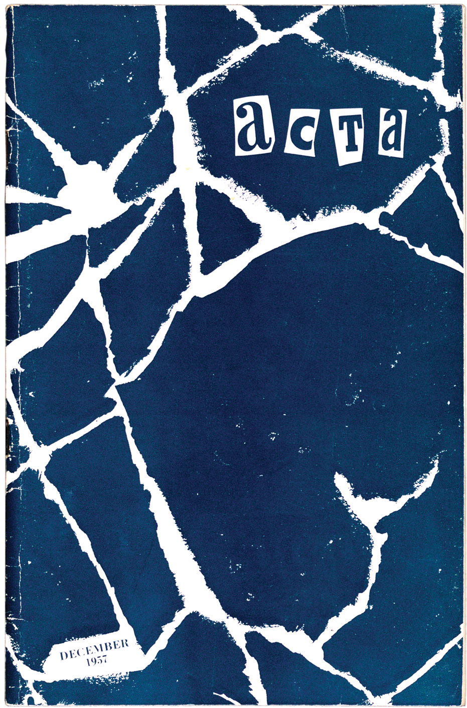
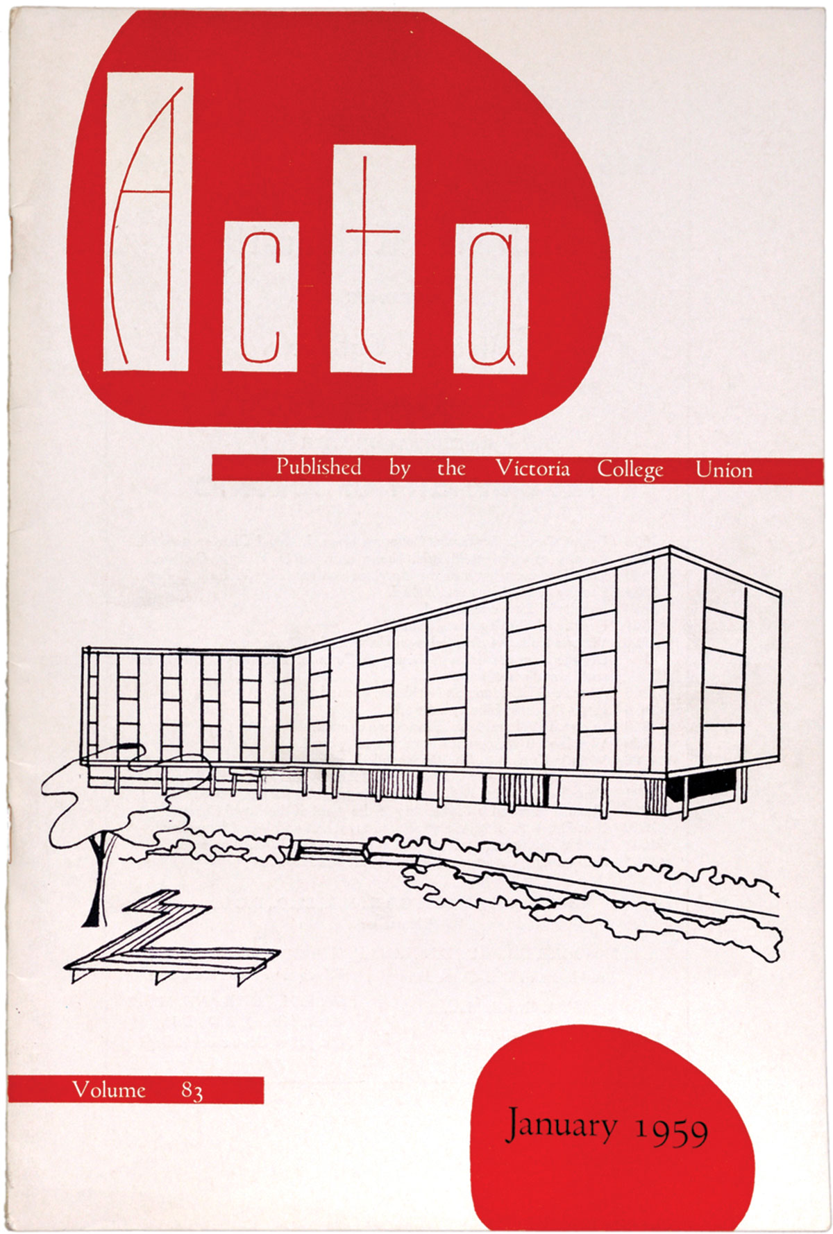
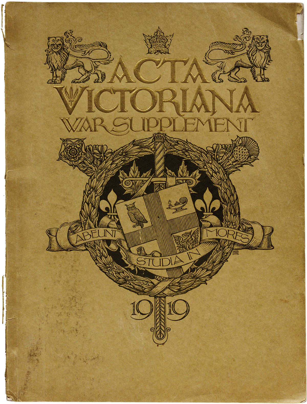
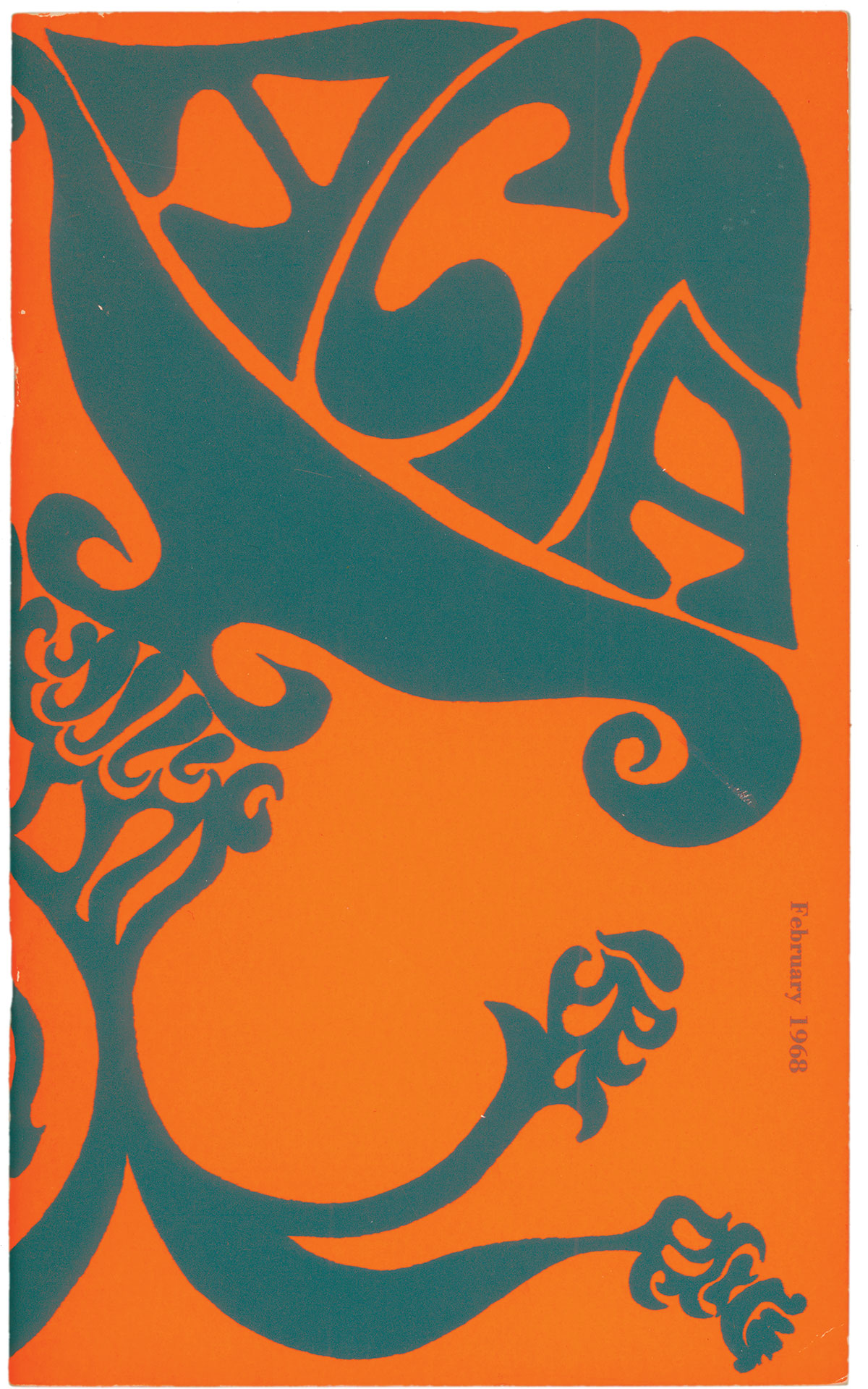
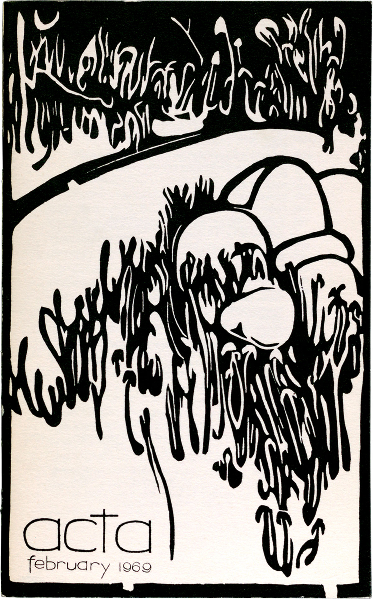
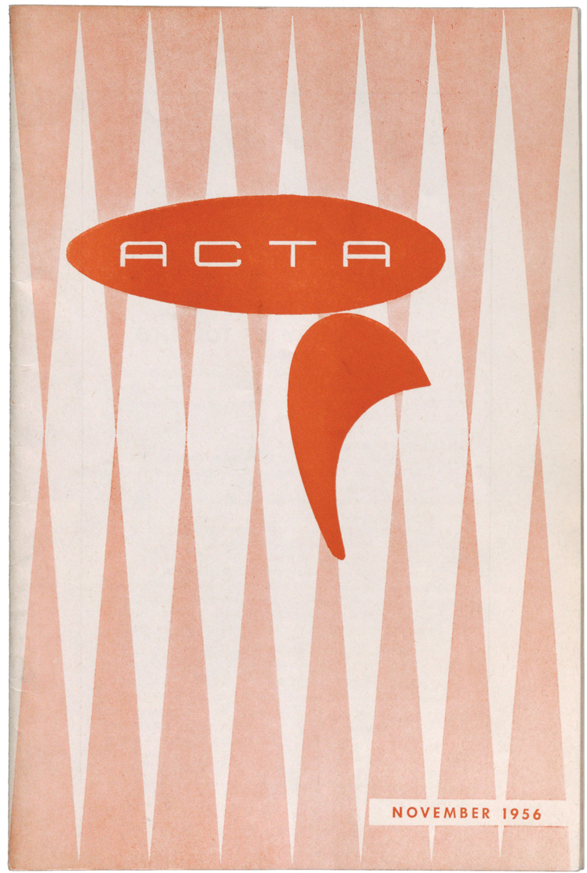
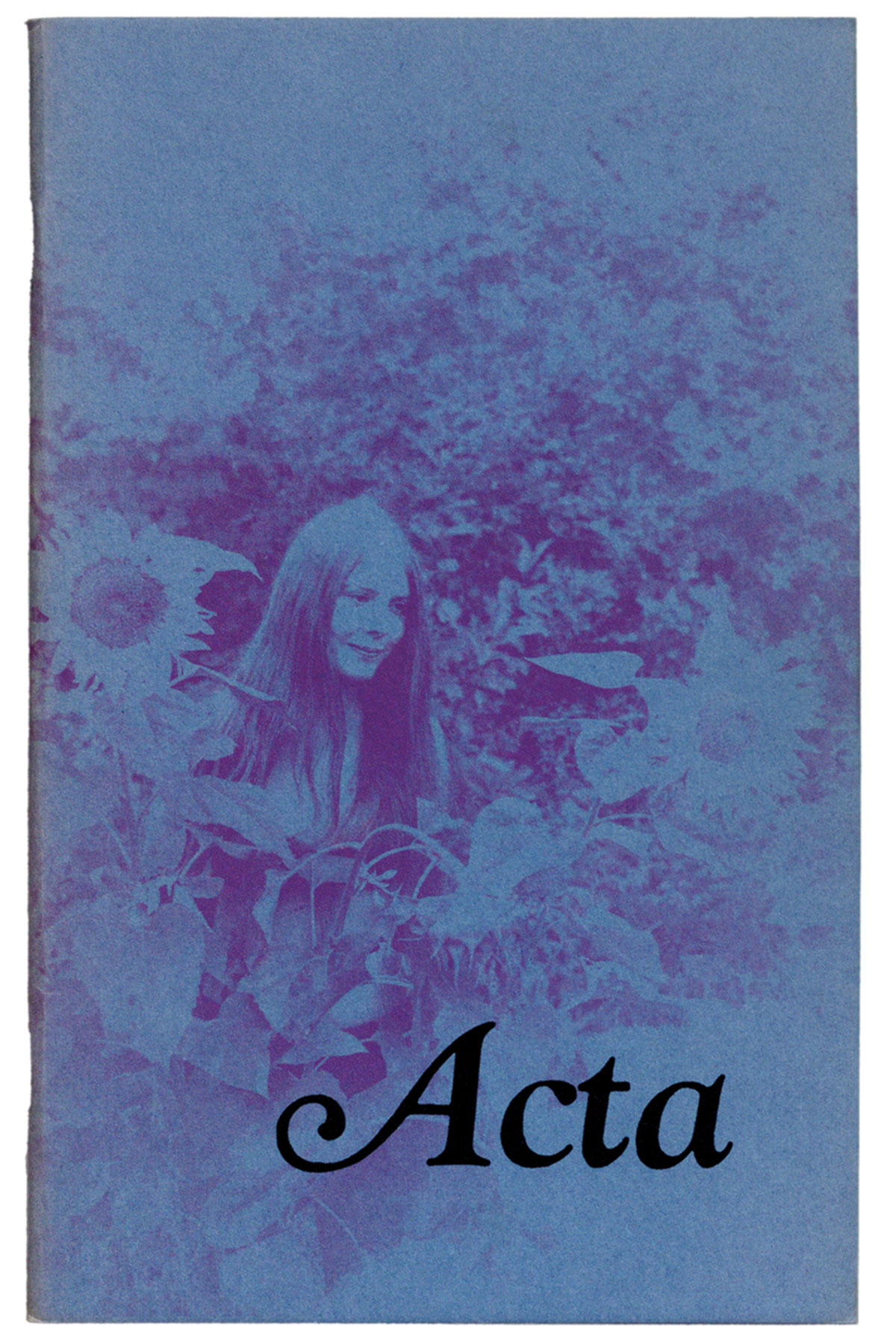
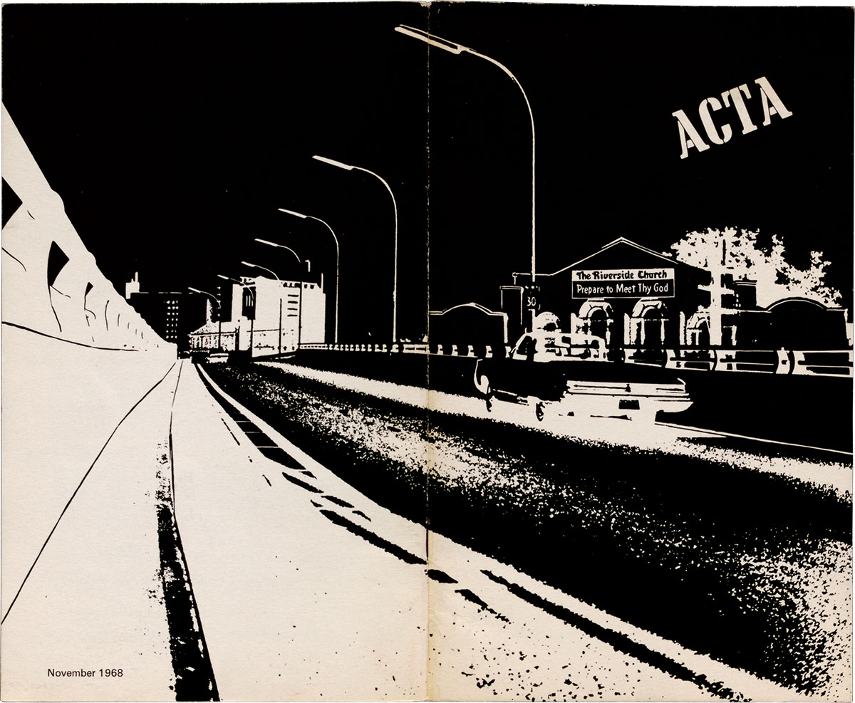
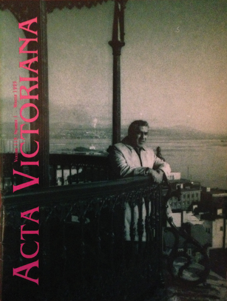
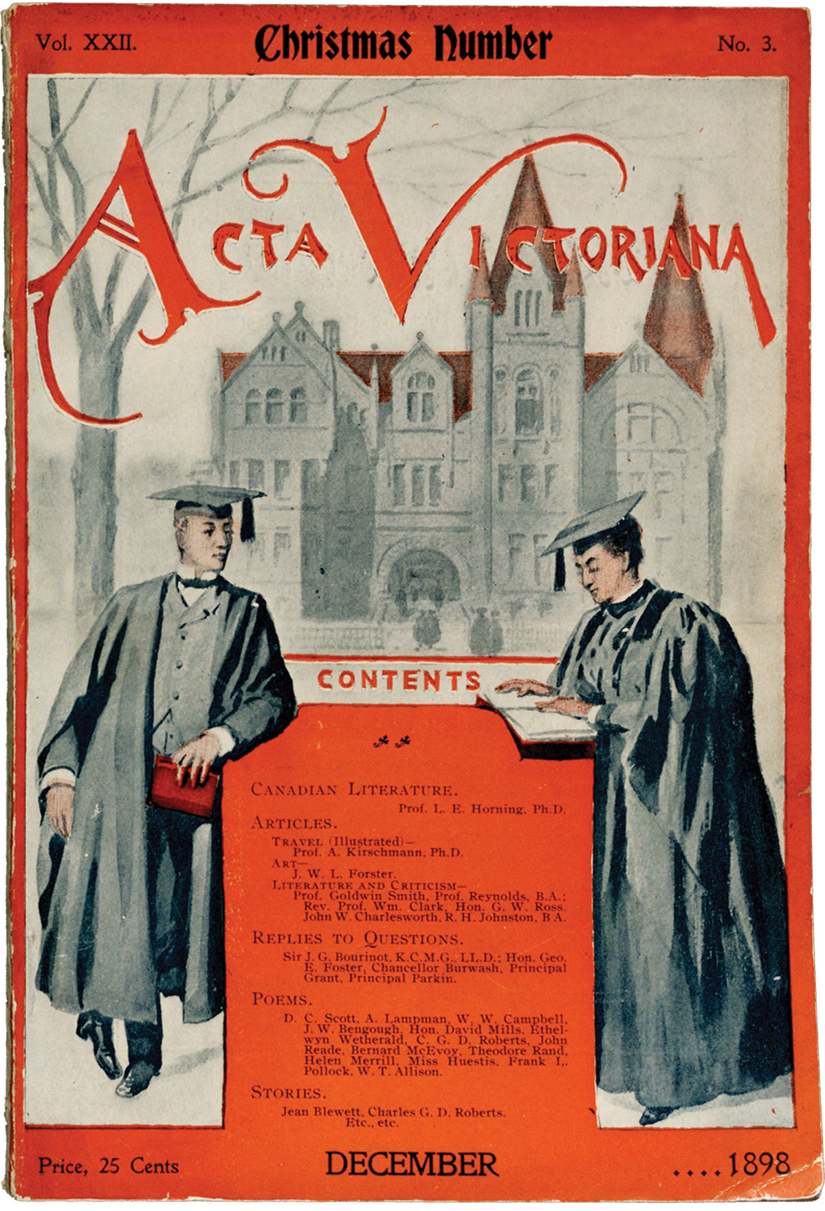
The upshot is that lit-mag covers form a sort of ongoing Rorschach blot of undergraduate intellectual self-branding—and I mean that in a good way. Acta is Canada’s longest-running literary magazine, turning a hundred and thirty-five this year. Perusing old Acta covers, you can see the eras shift before your eyes. In 1898, it’s a black-robed homage to Canada’s anxious emulation of British college life. By 1935, Modernism takes hold, and it’s a stark slash of woodcut, all sharp edges and void. By 1956, the groovy logo looks like something you’d have seen in a Pan Am marketing campaign. Then the sixties arrive and it’s trippy, hand-drawn fonts redolent of Grateful Dead posters, or pre-Instagrammatic pictures of hippie students in a field.
They’re by turns striking and charming, and occasionally quite beautiful: the face of student literature, one year at a time.